Every launch has the same shape. You plan the product for months and the launch for about four days. Then on the morning, you are writing the post, answering the first comments, fixing the thing that broke, and someone asks for a logo at 512px.
The images are the part that always gets compressed, and they are the part that decides how the launch looks to somebody who has three seconds of interest.
Here is the folder to have before the morning starts.
The short list
One hero image. Your product, framed, on a background, looking like software that exists. This is the image on the launch post, the one in the tweet, the one journalists screenshot. If you make one thing, make this.
Three to five feature shots. One screen each, same treatment, showing the things the product does. These carry the thread, the Product Hunt gallery and the follow-up posts for the next two weeks.
A mobile view, if you have one. Someone will ask.
A wide banner. 1920 × 1080 or thereabouts. Covers the slide, the newsletter header, the "about" section.
The square. 1080 × 1080. Instagram, LinkedIn carousels, and about half of everything else.
A logo on transparent. PNG and SVG. This is the request that arrives at 4pm and takes forty minutes because nobody can find the file.
That is six items. It is roughly an hour if you have a treatment, and most of a day if you do not.
Where each one goes
- Product Hunt — the gallery wants a landscape set. First image carries
- most of the click-through; the rest are scrolled fast. Lead with the hero
- and put the clearest feature second.
- X — 1600 × 900 in the first post of the thread. Images in a thread's
- first post materially change how far it goes.
- LinkedIn — 1200 × 627. Different audience, more patient, and a good
- place for the before/after framing rather than the hero.
- The launch email — the wide banner at the top, one feature shot per
- section. Keep them under 200KB each or the email clips.
- Your own site — the hero, above the fold, at a size that does not
- reflow the page while it loads.
Make them a set, not six pictures
The thing that makes a launch look funded rather than improvised is not the quality of any single image. It is that they match.
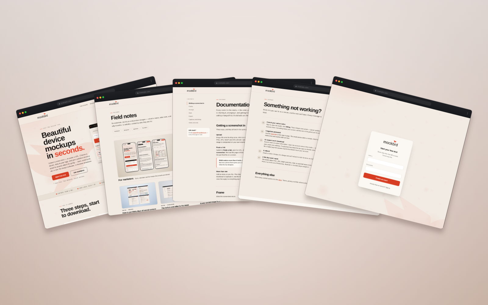
Same background, same frame, same light, across everything. The hero, the feature shots and the banner should obviously be from the same place. When they are, a stranger scrolling past three of your posts in a week accumulates an impression of one product. When they are not, they see three unrelated things.
This is also the cheapest possible substitute for a brand. You may not have a designed identity yet. A consistent treatment across every image you post does most of the same work for the first year.
The mistakes that cost the most
A hero with no product in it. Illustration, abstract gradient, your logo on a color. It tells nobody what the thing is. The single highest-performing launch image is almost always a clear picture of the actual interface.
Text too small to survive the feed. Your hero will be viewed at about 400px wide on a phone. Any UI text in it is decorative at that size — which is fine, as long as the composition still reads. Check it by shrinking the image to 400px and looking at it, not by zooming in.
Screenshots with your test data in them. "asdf", "Test User", a row of lorem ipsum, a notification badge showing 47. It is the fastest way to make a real product look like a prototype. Seed the account properly before you capture.
A different aspect ratio everywhere. Composing at the destination shape and cropping from one master are not the same thing. A 1200 × 627 crop of a square composition cuts the top and bottom off your product.
Making it all on the day. The predictable one. The assets are the part you can do a week early, and the only part.
A realistic timeline
- A week before — capture the screens with real data. Pick the treatment:
- one background, one frame. Build the hero.
- Four days before — the feature set and the banner. Export everything
- to every destination size at once.
- Two days before — look at them all at thumbnail size on a phone. Redo
- whatever does not read.
- The day before — put the logo files in the same folder. Write the alt
- text.
- Launch day — post. Do not open the design tool.
The images are the only part of a launch you can finish early. Finishing them early is the entire difference between a launch day spent talking to people and one spent exporting PNGs.
The underlying idea
Launch day is a day for answering people, not for making things. Put six images in a folder a week beforehand, make them look like they came from the same place, and the day belongs to you rather than to your design tool.