Almost every image you make is a matter of taste. Store screenshots are not. They are the one place where a reviewer — or, more often, an automated check — measures your file and refuses it. A LinkedIn post at slightly the wrong size gets cropped. A Play Store upload at slightly the wrong size gets a red box and a rejection.
So this is the short, boring, useful version: the sizes, the rules that actually cause rejections, and how to stop guessing.
The sizes Apple requires
Apple asks for screenshots at the resolution of specific devices, not at an aspect ratio. You give it pixels.
- iPhone 6.9″ — 1320 × 2868 portrait, or 2868 × 1320 landscape. This is
- the current required size for iPhone.
- iPhone 6.5″ — 1284 × 2778. Still accepted in place of 6.9″ on many
- submissions, which is why it is worth keeping around.
- iPad 13″ — 2064 × 2752 portrait, or 2752 × 2064 landscape. Required if
- your app supports iPad at all, and this is the one people forget until the
- submission stops.
You need a minimum of one screenshot per device family you support, and you can supply up to ten. Apple will scale your 6.9″ set down for smaller iPhone sizes, so in practice one good set covers the phone.
The sizes Google requires
Google Play is looser about dimensions and stricter about a couple of other things.
- Phone — 1080 × 1920 is the recommended size. Play accepts a range, but
- a 16:9 portrait at 1080 wide is what every listing you admire is using.
- Tablet (7″ and 10″) — 1920 × 1080 landscape.
- Feature graphic — 1024 × 500, and this one is exact. It is the banner
- at the top of your listing, it is mandatory, and it is the single most
- commonly failed asset on Play.
You need a minimum of two screenshots to publish, and the feature graphic is not optional.
The three rules that actually get uploads rejected
Sizes are the easy part. These are what catch people.
No transparency. Both stores reject PNGs with an alpha channel on store screenshots. If your mockup has a transparent background — which is a perfectly sensible thing to want everywhere else — it will fail here. Flatten it onto a solid background, or export as JPG.
Exact, not close. A feature graphic at 1200 × 586 is the right shape and the wrong file. Play measures it. This is the failure mode that wastes the most time, because the image looks completely correct to you.
No device frames inside Apple's screenshots. Apple's guidelines ask for the app's UI, not a photo of a phone containing the app's UI. A frame drawn inside a 1320 × 2868 screenshot means your actual interface is now 60% of the area, and Apple has rejected submissions for it. Google is more relaxed and framed screenshots are common on Play, but you are still spending pixels on a bezel rather than on your product.
That last one surprises people, so to be clear about what is and is not allowed: a background, a headline, a caption and some brand color around your UI are all fine and are what good listings do. A drawn iPhone bezel around your UI, inside an iPhone screenshot, is the thing to avoid.
Why "the right shape" is not the same as "the right size"
Here is the failure I see most, and it is subtle enough to be worth spelling out.
You set up a canvas at the correct aspect ratio — 1024 × 500 is 2.048:1, so you build at 2.048:1 — and then export at whatever resolution your tool prefers. Most tools round up to a comfortable number. You get 1600 × 781.
That is the right shape. It is not 1024 × 500, and Play will not take it.
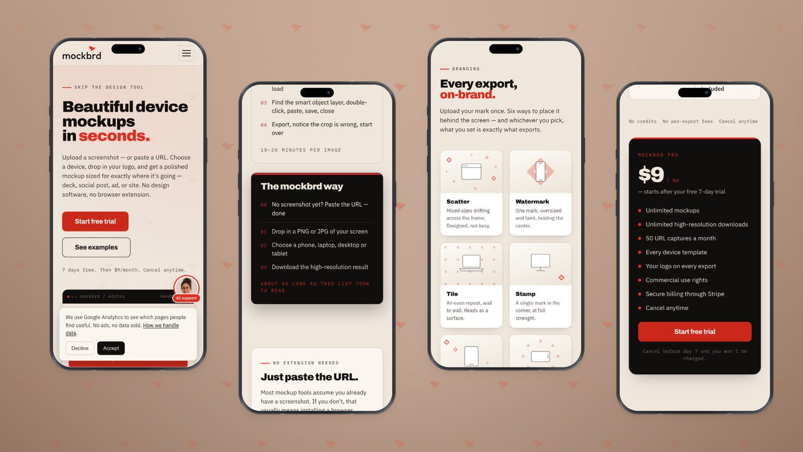
The fix is a tool that treats store sizes as an exact pixel target rather than a ratio to be scaled. In mockbrd the eight store presets are marked as exact: choose Play feature and the export is 1024 × 500, not the nearest step on a resolution ladder.
What to actually put in them
The sizes get you accepted. These get you installed.
The first two are the whole game. On both stores, most people see two screenshots without scrolling, and a large share never scroll. Whatever your best argument is, it goes in slots one and two. Not your onboarding screen.
Caption them. A screenshot of a UI is a screenshot of a UI. A short line of text above it — five or six words, big — turns it into a claim. "Every receipt, found in a second" beats a picture of a search field.
Make them a set. Same background, same type, same position for the caption across all of them. A listing where each screenshot has its own treatment reads as five separate attempts, which is exactly the impression you do not want at the moment of installing something.
Portrait, unless you are a game. Landscape screenshots display smaller in the list and most non-game apps get nothing from them.
A working process
- Capture your real screens at the device's own width, so the layout in the picture is the layout a user will get. A desktop page squeezed into a phone frame is not your mobile design.
- Build one treatment — background, caption position, type — and apply it to every screen in the set.
- Export at the exact store size, with no transparency.
- Upload the first two, look at them in the store's own preview at the size they will actually appear, and be honest about whether the caption is legible.
The store listing is the only page where your competitors are one thumbnail away. Every other channel gives you a moment of attention; this one gives you a comparison.
The underlying idea
Store screenshots are an acceptance test wearing the costume of a design task. Get the pixels exactly right, strip the alpha, and put your best argument in the first two slots. Everything after that is craft — and craft only matters once the file is accepted.