The reason most product marketing calendars die in week two is not a shortage of ideas. It is that every post needs an image, every image needs a designer, and the designer has a roadmap of their own.
So the calendar becomes text posts, then it becomes nothing.
The way out is not more ideas. It is realizing that a product you already shipped contains about thirty posts, and that the images for them are the same handful of screenshots arranged differently.
Start with the screens, not the calendar
Open your product and screenshot every meaningful state. Not every page — every state. The empty state, the filled state, the moment something succeeds, the settings nobody sees, the thing that only appears when you have twenty of something.
Most products have between eight and fifteen of these. That is your raw material, and it is already more than a month of posts if each one can carry two or three angles.
The angles that work on a single screen
Take one screenshot. Here are the posts it can be.
The feature, stated plainly. What this screen does, in one line. Boring, necessary, and the one most teams skip because it feels too obvious.
The before. The spreadsheet, the inbox, the thing your customer does now. Pair it with the after. This is the highest-performing shape in B2B and it costs you one extra image.
The detail. Zoom into one corner — the empty state copy, the keyboard shortcut, the way the number animates. Craft posts get disproportionate engagement from exactly the people who buy tools.
The changelog. "This shipped today." Small, frequent, and it reassures people the product is alive, which is a real objection in early-stage software.
The question. Post the screen and ask what people would change. You get engagement and you get research.
The number. Overlay one figure on the screen. Adoption, speed, whatever you have.
Six angles, ten screens. That is sixty posts, and you only needed thirty.
Why the images are the bottleneck, and how to remove it
Here is the arithmetic that kills the calendar. Thirty posts, each needing an image, each image taking twenty minutes in a design tool. That is ten hours a month of somebody's time, and it is the first thing cut.
The fix is to stop making each image and start making a treatment.
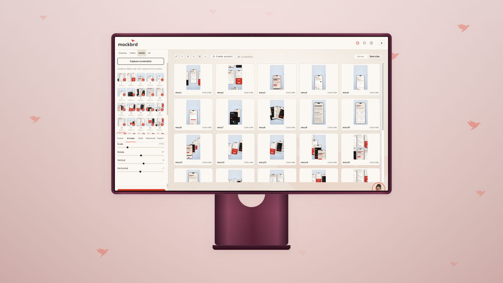
Pick one background, one device frame, one arrangement. Apply it to every screenshot in the set. Now making an image is: drop in a screenshot, export. Under a minute, and — more importantly — it produces a feed that looks like one company rather than thirty separate decisions.
This is also why a batch beats a trickle. Sit down once, run every screen through the same treatment, export the lot, and you have a folder of images to schedule against. The creative decision happens once.
One image is four images
Every platform wants a different shape, and this is where another hour a month disappears.
- LinkedIn — 1200 × 627. The feed workhorse for B2B.
- Instagram — 1080 × 1080 square, or 1080 × 1350 if you want the tallest
- the feed will show you.
- Story and Reels — 1080 × 1920, full bleed.
- X — 1600 × 900.
Resizing a finished image is not the answer: a 1200 × 627 landscape crop of a square composition loses the top and bottom of whatever you were showing. The image has to be composed at each shape, which is a re-layout, not a crop.
That is worth automating rather than doing by hand. Build once, export to each destination, and the device re-places itself for the shape instead of being cropped out of frame.
A calendar you can actually run
Four posts a week, one of each kind:
- Monday — the before/after. Highest reach, sets up the week.
- Wednesday — the detail or the craft post. Talks to practitioners.
- Friday — the changelog. Small, honest, cumulative.
- One a week — the question or the number. Whichever you have.
That is sixteen a month with a clear reason for each, and every one of them is a screenshot you already own with a treatment you already built.
A consistent feed of ordinary posts outperforms an occasional brilliant one, because the thing you are actually buying is being remembered in week six.
What to measure, honestly
Engagement on a product post is a vanity number unless it moves something. Two things worth watching:
Profile visits. People who like a post forget it. People who click through to see who you are were actually interested.
Saves and shares over likes. A save means someone wants it later. On LinkedIn and Instagram both, it is the strongest signal that the content was useful rather than pleasant.
If neither moves after a month of consistent posting, the problem is the angle, not the frequency. Change what you are claiming, not how often.
The underlying idea
You are not running out of content. You are running out of images, and that is a production problem with a production answer: one treatment, applied to screens you already have, exported to every shape at once.
Decide how it looks once. Then the calendar is just work, and work you can actually do in an afternoon.