Across almost every channel and audience, one image shape beats the others: two states, side by side, with something obviously better about the second.
It works because it does the comparison for the viewer instead of asking them to imagine it. A single screenshot of your product requires the viewer to picture their current situation and subtract. A before-and-after has already done that, which is most of the cognitive work of being persuaded.
It is also the easiest image shape to get wrong in a way that destroys its own credibility.
What the "before" should be
Not your competitor. Not a strawman. The thing your customer is doing now, which is almost always one of:
- A spreadsheet
- An inbox
- A shared document with eleven comments
- A whiteboard photo
- Three tools and a copy-paste between them
The most persuasive before is a genuinely reasonable way of working that happens to be tedious. Your reader should recognize it and feel slightly caught out.
A before that looks incompetent does not land, because nobody identifies with it. If your before is a spreadsheet, make it a good spreadsheet — the kind a capable person built — and let the after win on effort rather than on competence.
The rules that keep it fair
A comparison is an argument, and an unfair one is detected instantly, even by people who cannot articulate what is wrong.
Same size. Both images at the same dimensions. An after that is larger is transparently weighted and the reader discounts the whole thing.
Same treatment. Same background, same frame, same shadow, same light. If the after is on a nicer ground, you are comparing grounds.
Same task. Both images doing the identical job, not "their worst case versus our best case".
Same data. The same names, the same numbers, the same month. Different data on each side means the reader cannot tell what changed.
Label them. "Before" and "After" in the same place on both. It sounds patronizing. It is not — a surprising share of readers cannot tell which is which on a fast scroll, and if they read it backwards your image argued against you.
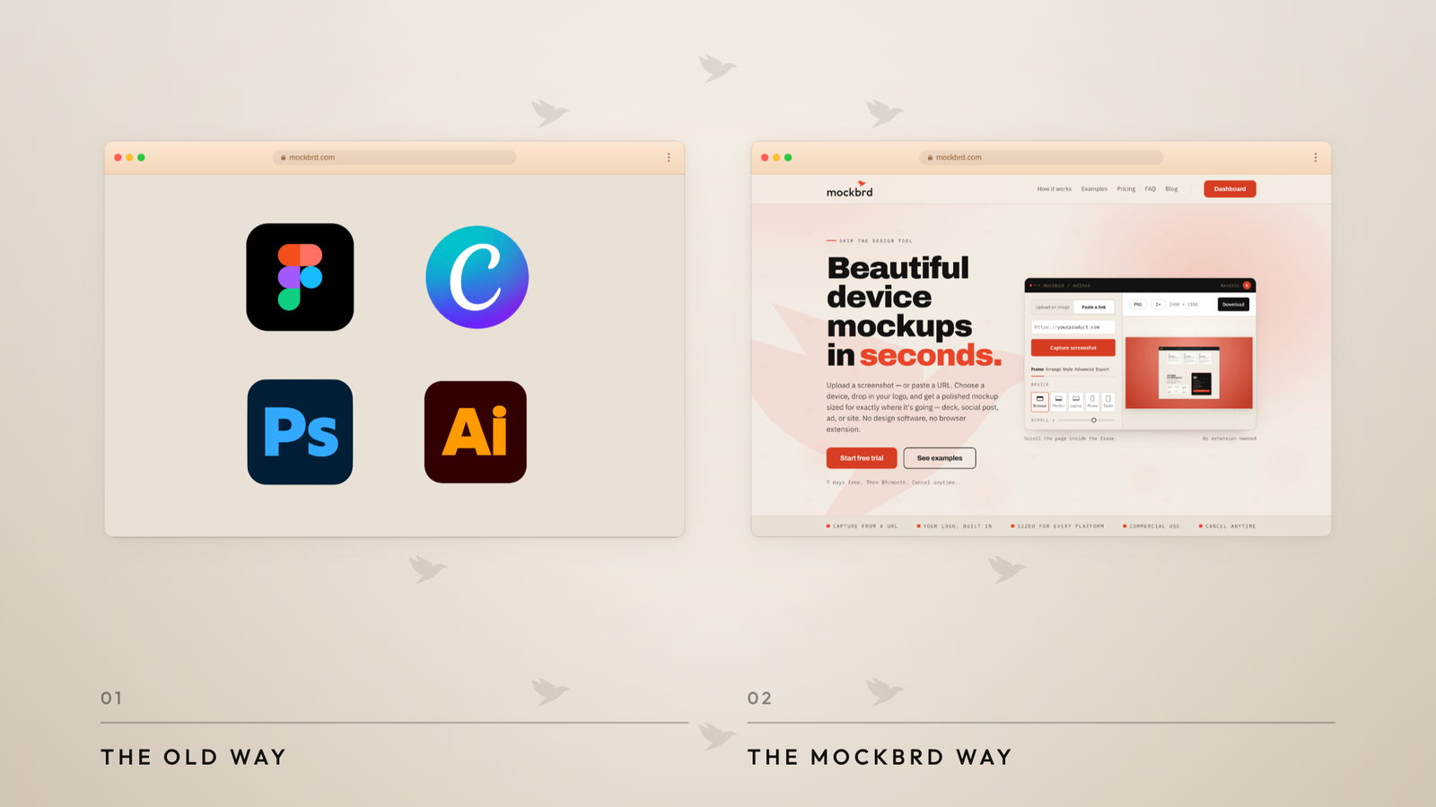
Which layout for which point
Side by side is the default and works when both states are legible at half width. Before on the left, after on the right — the order matters because English reads left to right and the second position is the resolution.
Stacked is better for tall content, and slightly better on mobile where side-by-side halves are tiny. Before on top.
A slider is tempting and mostly a mistake for marketing. It requires interaction, it does not survive being screenshotted into someone else's deck, and it does not work at all in an email or a feed preview.
One image, split diagonally is clever and costs you legibility on both halves. Save it for a hero where the point is the vibe rather than the detail.
The versions that go wrong
The unreadable comparison. Two full screenshots side by side, each now 500 pixels wide in the feed, and neither readable. If the point is a specific difference, crop both to that region. A comparison of two things nobody can see is a picture of two rectangles.
The invisible difference. You know what changed. The reader does not. If the difference is subtle, the image needs to point at it — a crop, a circle, or a caption naming it in five words.
The exaggerated before. Twelve red error states, a chaotic spreadsheet nobody would actually have. It reads as advertising and it makes the after suspect too.
The missing unit. "Before: 40. After: 4." Forty what? Minutes? Clicks? Steps? A comparison without a unit is a number without a claim.
The uncredited competitor. Using a named competitor's UI as your before is legally murky, reputationally worse, and reliably attracts a reply from someone who works there. Use the generic version of the problem.
Where to use them
- LinkedIn — the strongest performer in B2B by a margin. Side by side,
- 1200 × 627, with the unit in the caption.
- The top of a landing page — above the fold, as the hero. It answers
- "what is this for" faster than a headline.
- A cold email — one image, stacked, no more than 150KB.
- Sales decks — as the second slide. Most decks earn attention on slide
- two or lose it.
The underlying idea
Show the situation your reader is actually in, then show it resolved, and make the two images identical in every respect except the thing you are arguing about.
The persuasion is not in the after. It is in the fairness of the comparison — which is the part most people skip, and the only part the reader is unconsciously checking.