Every few months a platform changes a number and half the internet's "social media image size cheat sheet" articles quietly go out of date. The numbers move. The shapes do not.
There are really only four shapes worth knowing, and once you can see them you can post anywhere without looking anything up.
The four shapes
The wide one — about 1.91:1. LinkedIn, Facebook, and most display ads land here. It is very nearly 16:9 but not quite, which is why a YouTube thumbnail dropped into a LinkedIn post gets a sliver cropped off. Close enough to reuse, far enough to notice.
16:9 — 1.78:1. YouTube thumbnails, X posts, slides, anything that will end up on a screen. The most forgiving shape there is, because every screen in the world is roughly this shape.
The square — 1:1. Instagram's old default, and still the safest thing to post when you do not know where it is going. A square is never badly cropped because there is no long axis to crop.
The column — 9:16. Stories, Reels, TikTok, and any full-screen phone surface. This is the one people get wrong most often, because it is not a wide picture rotated. It is a different composition with different rules.
There is a fifth worth knowing if you care about Pinterest: 2:3, taller than a square but not a column. It exists because a feed of tall images fills a phone screen with fewer scrolls.
Why the column is different
A wide image is a scene. You can put a thing on the left and another on the right and let the eye travel between them.
A column has no left and right worth using. It has a top and a bottom, and about 15% at each end will be covered by interface — the caption, the buttons, the profile picture. Anything important in those bands is not really there.
So the composition rule for 9:16 is the opposite of the rule for 16:9: one subject, centered, with generous space above and below that you are happy to lose. If you find yourself trying to fit three things side by side in a column, you are fighting the shape.
Export once, at the right size
The temptation is to make one nice image and resize it for everywhere. It mostly works and it always shows: a 16:9 export squeezed into a square either crops the ends off your subject or leaves two bands of dead space.
It is less work than it sounds to do it properly, because the shape changes what the picture should be, not just how big it is. A device sitting centre-frame in a square wants to be one device. The same subject in a 2400×800 strip wants to be three, running off both edges.
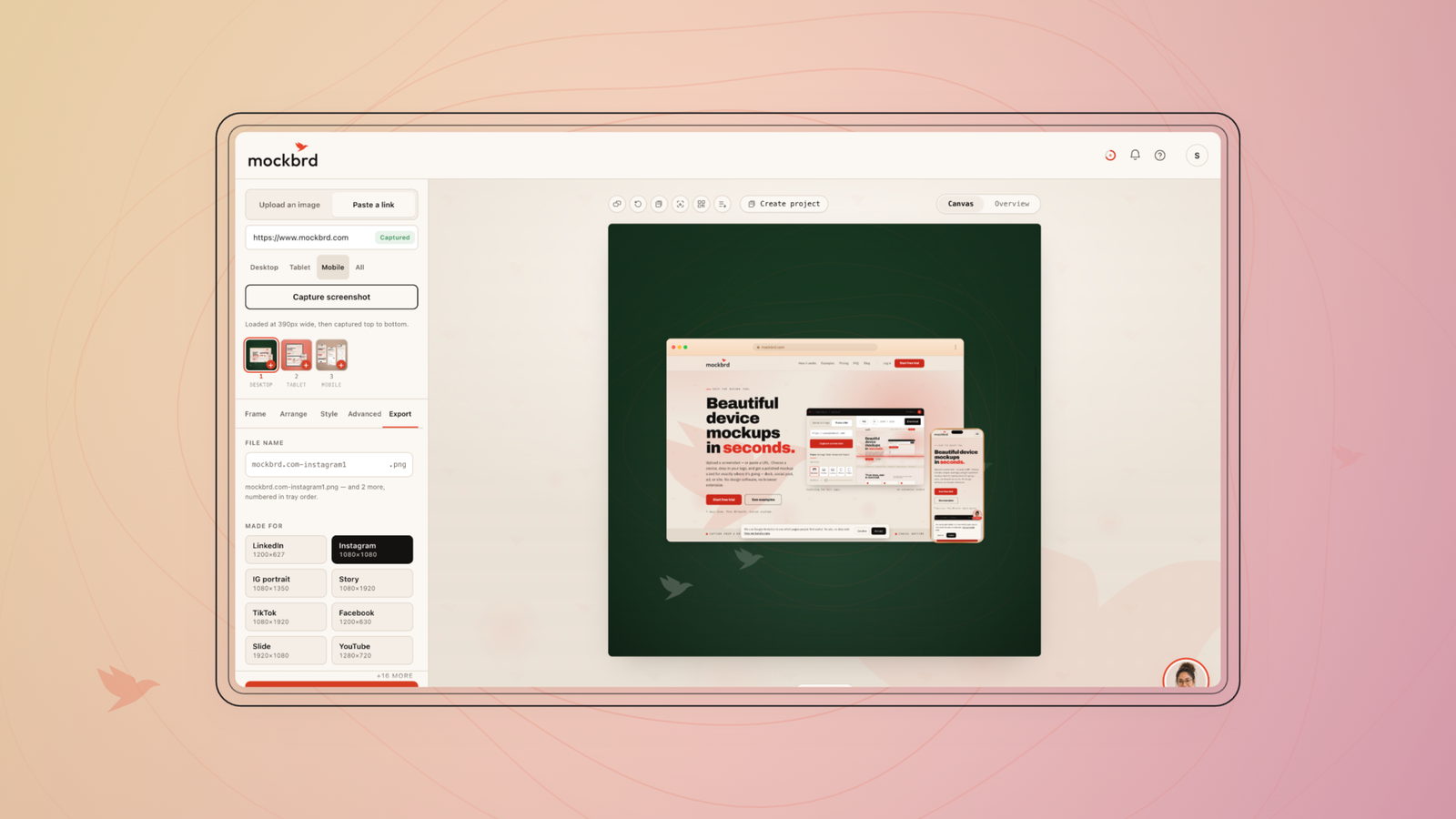
mockbrd exports at sixteen presets for exactly this reason — the shape you pick changes the canvas, and the arrangement that suits it changes with it.
The pixel counts, for when you need them
Use these as starting points, not gospel. Platforms adjust them, and every one of them accepts larger images and scales down — so when in doubt, export bigger and let the platform do the shrinking.
- LinkedIn, Facebook, display ads — 1200×627 (1.91:1)
- YouTube thumbnail — 1280×720 (16:9)
- X post image — 1600×900 (16:9)
- Instagram square — 1080×1080 (1:1)
- Instagram portrait — 1080×1350 (4:5)
- Stories, Reels, TikTok — 1080×1920 (9:16)
- Pinterest pin — 1000×1500 (2:3)
- Slides and presentations — 1920×1080 (16:9)
Notice how few distinct shapes that is. Eight destinations, five shapes, and two of the five are the same 16:9 at different scales.
Learn the shapes. The numbers will keep moving without you.