There is a specific failure in agency presentations that has nothing to do with the quality of the work.
You built something good. You export the screens the night before, drop them into the deck, and present. The client is quiet, then asks whether it is finished. It is finished. It just does not look it, because eleven raw PNGs on white slides look like a folder someone opened in front of you.
That gap is entirely presentational, and closing it takes about twenty minutes.
Why raw screens undersell finished work
A screenshot pasted onto a slide has no scale, no context, and no implied medium. The client cannot tell whether they are looking at a desktop page, a tablet layout or a wide phone. They cannot tell whether the grey around the edge is your background or theirs.
So they do the only thing available and evaluate it as a picture — which means they notice the things a picture has, like the colors and the amount of white space, and not the things the work has, like the decision you made about the navigation.
A frame fixes most of this in one move. It says: this is a website, in a browser, at desktop width, and the grey around it is not part of your brand.
One treatment, every slide
This is the rule that does the most work, and it is not about taste.
Pick a background, a device and a shadow. Use them on every screen in the deck. Not "similar" — the same.
What this buys you is that every difference the client notices between slide four and slide nine is a difference in the design. When each screen sits on its own background, the client's eye spends its attention comparing grounds, and the comparison you wanted them to make never happens.
It also buys you something less obvious. A deck where every screen shares a treatment reads as a considered system. A deck where they do not reads as a set of files, and a client who reads it as a set of files feels entitled to reorder it.
Match the ground to their brand, not yours
A small thing that lands disproportionately well: set the background of your mockups to a desaturated version of the client's brand color.
Not the brand color at full strength — that fights the screenshot and the screenshot always loses. A pale, low-saturation version of it. The client recognizes it without being able to say why, and the whole deck reads as having been made for them rather than adapted from your last project.
It takes one color pick and it is the cheapest piece of account management available.
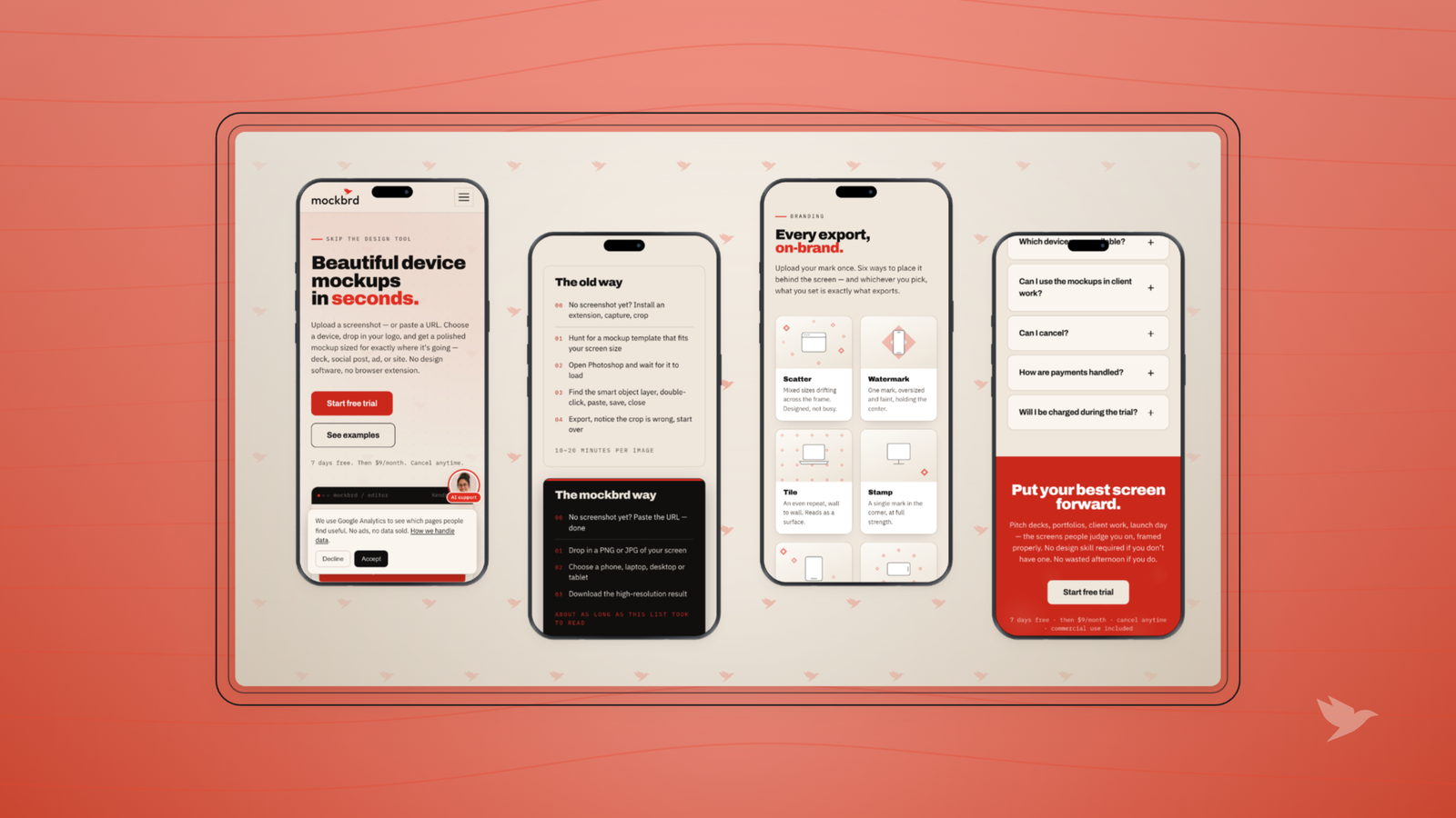
Use the arrangement to say what kind of slide it is
Different compositions carry different messages, and using them on purpose saves you a paragraph of speaking.
- One screen, centered, large. This is the hero. Use it for the single
- decision you want approved, and use it once.
- Two side by side. A comparison. Before and after, or two directions you
- are asking them to choose between.
- A grid of four or six. Scope. "Here is the whole thing." Good for the
- slide where you establish that the work is bigger than the two screens
- they remember.
- A cascade or a stack. A sequence. Step one, step two, step three —
- useful for a flow, where a grid would imply these are alternatives rather
- than a path.
- A wall running off the frame. Volume. Use it when the point is "there
- are forty of these", not when there are four.
The mistake is using the same composition for all five jobs, usually the grid, which quietly tells the client that everything is an alternative to everything else.
What to do the night before
A realistic version, because this is always a night-before task.
- Export every screen at one width. Mixed widths are the most common reason a deck looks uneven, and it is invisible until you flick through.
- Build the treatment once — ground, frame, shadow — and apply it to the set rather than styling each one.
- Order the deck before you polish it. Hero, scope, decisions, sequence, ask. If a screen does not have a job in that order, cut it.
- Look at it at thumbnail size. Open the slide sorter. Anything that does not read at that size will not read from the back of a room either.
- Leave one slide with nothing but the question you want answered. The most common way a good presentation fails is that nobody knew what they were being asked.
The one that costs you the room
Two screens in the same deck at different zoom levels.
It looks like a small thing. What it actually does is break the client's sense of scale, so when they compare the navigation on slide four to the navigation on slide seven, one of them looks heavier — and they will tell you they prefer the other one for a reason that does not exist.
Same width, every time. If a screen genuinely needs to be bigger, make that a deliberate hero slide with nothing else on it.
Presentation is not decoration on top of the work. It is the difference between a client evaluating your decisions and a client evaluating your file exports.
The underlying idea
The client cannot see the work. They can only see the pictures of it. Make the pictures consistent, framed and ordered, and the conversation moves to the thing you wanted to talk about — which is the design, not whether it is finished.