A design hiring manager with forty portfolios to get through gives each one somewhere between sixty and ninety seconds before deciding whether to read properly. That is not cynicism, it is arithmetic.
Almost every case study is built as though it will be read start to finish. That is why so many good designers have portfolios that underperform their work.
What the first ninety seconds are actually for
The reviewer is answering three questions, in this order:
- Can this person make something that looks finished? Answered from the images alone, in about two seconds.
- Did they decide anything, or did they decorate? Answered by scanning headings.
- Would I want them in a room? Answered by how the writing sounds.
Everything else — your persona slides, your competitive audit, your double-diamond diagram — is read only after all three come back positive. Which means the top of your case study is doing work that the middle thinks it is doing.
Lead with the artifact
The first thing on the page should be the best image of the finished thing. Not your process. Not a title card. The work.
This feels wrong to a lot of designers, because the process is the value and the artifact is just the residue. Both true. But the reviewer cannot evaluate your process until they believe you can build — and they will read three times as much of your process if the first image earned it.
Put the strongest screen at the top, at full width, framed properly. Then tell the story.
The structure that survives a skim
Write it so someone reading only the headings gets the whole argument.
- What it is — one line. "A scheduling tool for clinics with fewer than
- ten staff."
- What was wrong — one paragraph, with a number in it if you have one.
- What I changed — the section with the images in it. Three or four
- decisions, each with a before and an after.
- What happened — the outcome. Honest, including when it is small.
- What I would do differently — short, specific, and the section that
- makes senior reviewers trust you.
That last one is the highest-leverage paragraph in a portfolio and almost nobody includes it. A designer who can name the weakness in their own work is a designer who can take feedback, and that is most of what hiring for mid-level is about.
Show the before, always
A redesign with no "before" is a picture. A redesign with a before is an argument.
This is the single biggest difference between portfolios that read as professional and portfolios that read as student work, and it costs you one screenshot. Even when the before is your own earlier version. Especially then.
Put them side by side, at the same size, on the same background, with the same frame. Any difference between them that is not the design itself weakens the comparison — if the after is bigger, better lit and on a nicer background, the reviewer discounts it, correctly.
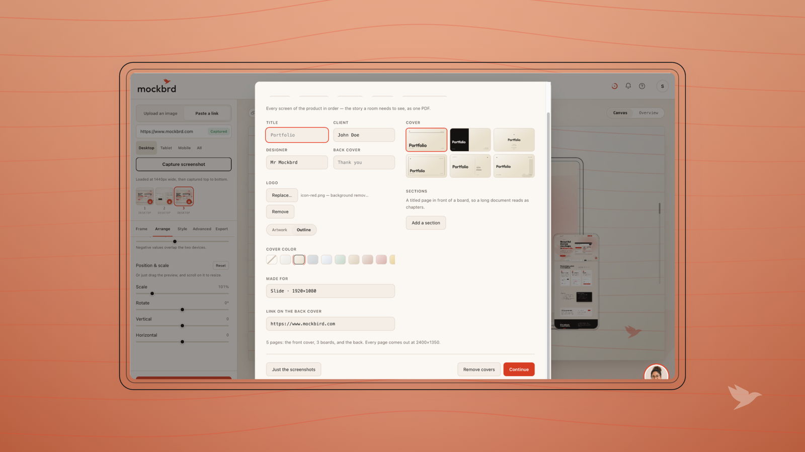
Make the images look like one project
Here is the thing that separates a portfolio that looks senior from one that does not, and it has nothing to do with the design inside the screens.
Pick one treatment — one background, one device, one shadow — and use it for every image in the case study. When each screen has its own background color and its own frame, the set reads as a collection of attempts. When they share a treatment, it reads as a product.
The variation should come from what is on the screens. That is the only variation the reviewer is there for.
The same applies across case studies, with one adjustment: keep the frame and the light constant, and let the background shift per project. That gives each project its own identity while the portfolio still reads as one person's work.
Write like a person who was there
Case study prose has a house style and it is terrible. "I conducted user interviews to synthesize insights which informed the ideation phase."
Nobody talks like that, and it reads as someone describing a process they learned rather than work they did.
The alternative is just: say what happened.
"I sat with six clinic receptionists for a morning. Four of them had the same workaround — a paper list beside the monitor — because the software could not show tomorrow and today at once."
That is the same sentence doing four times the work. It has a number, a place, a specific observation and an implied design problem. And it sounds like a colleague rather than a candidate.
What to cut
- The persona. Unless it changed a decision you can point at.
- The competitive audit grid. Nobody has ever been hired off one.
- Every screen you made. Three good ones beat eleven.
- The moodboard. It shows taste you can also show in the actual work.
- Process diagrams with arrows in a circle. Every portfolio has one and
- they are all the same diagram.
The reviewer's time is the scarcest resource in the transaction. Cutting is the most respectful thing you can do with it.
Three case studies you have edited hard beat eight you have merely finished. The portfolio is itself a design problem, and editing is the whole of it.
The underlying idea
Your case study has ninety seconds to earn the ten minutes it deserves. Spend them on the work, framed well, with a before beside it — and write the rest as though a colleague asked you what you had been up to.