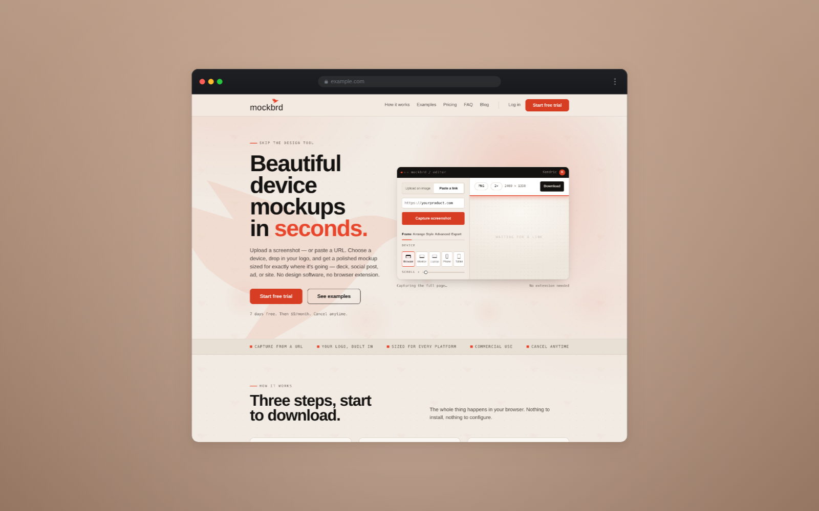
You can usually tell within half a second whether a product screenshot was made by someone who cared. It is rarely about skill. It is about five specific things, and all of them are fixable in about a minute.
1. The raw screenshot, unframed
A bare rectangle of interface floating on a white page reads as evidence, not as a product. It says here is a thing on my screen, when what you wanted to say is here is a thing you could be using.
A device frame does the work: it tells the eye this is software, running, on hardware a person would hold. The frame is not decoration. It is the sentence's grammar.
2. The drop shadow from 2011
A hard grey shadow offset down and to the right is the single fastest way to date a piece of design. Real light does not work like that. It comes from somewhere, it falls off gradually, and it is colored by whatever it bounces off.
If your shadow has a visible edge, it is too hard. If it sits directly under the object like a pool of ink, it is too tight. Wide, soft, and slightly tinted toward the background color beats anything with a defined shape.
3. Cropping the device in half by accident
There is a real technique where a device deliberately runs off the edge of the canvas — it implies the scene continues and it fills an awkward shape nicely. It works when it is obviously intentional: a decisive amount is outside the frame, and what remains is the part that matters.
It fails when it looks like the export was slightly too small. A phone with three millimetres of its corner missing is not a composition, it is a mistake, and people read it as one instantly.
Either commit or leave it entirely inside the frame.
4. Six colors fighting
Screenshots are already busy. Your interface has its own brand color, probably a second accent, some greys, some text. Putting that on a background with a strong color of its own means two palettes competing, and the screenshot always loses — which is a problem, because the screenshot is the subject.
The rule that works: the background must lose to the screenshot. Any color you like, as long as it is quieter than the thing sitting on it. A saturated background with a pale interface on it is a picture of a background.
5. Different treatment on every image
This is the one that separates a set from a pile. Five screenshots with five different backgrounds, five shadow depths and five device frames do not read as a product — they read as five attempts.
Pick a background, a frame and a light, and use them across everything in the set. The variation should come from what is on the screens, because that is the only variation your reader actually cares about.
A consistent set of five ordinary images beats five individually clever ones. Consistency is what makes it look like a company rather than a person with a screenshot key.
The underlying idea
None of the above is taste. They are all the same principle wearing different clothes: the screenshot is the subject, and everything else is there to make it easier to look at.
Frame it so it reads as software. Light it so it sits on something. Keep the background quiet. Keep the treatment the same. Then let the work be the interesting part.