A device frame is not decoration. It is a claim about your product: this is software, it runs here, and a person uses it in this posture.
Get the claim right and the image does an argument's worth of work before anyone reads a word. Get it wrong and you have spent your best pixels telling people something untrue about your own product.
What each frame actually says
A browser frame says: this is a web app, you reach it by typing a URL, and you are probably at a desk. It is the least romantic option and the right one more often than people choose it. If your product is a web app used at work, the browser frame is the honest frame, and honesty converts.
It also has a practical advantage nothing else has: the URL bar. A browser frame showing your actual domain is a small, free piece of brand placement in every image you make.
A laptop says: professional, portable, someone's own machine. It carries a slight premium connotation and reads as more considered than a bare browser. The cost is that your screen is now maybe half the area of the image, because the rest is keyboard and bezel.
A monitor says: this is serious, it is a workstation tool, it is big. Good for anything data-heavy, dashboards, editors, developer tools. Bad for anything you want to feel light.
A phone says: this is used in a moment, standing up, possibly on a train. It is the frame with the strongest emotional read and the worst information density — a phone frame in a landscape image wastes most of the canvas.
A tablet says almost nothing, which is the honest answer. Use it when the product genuinely has a tablet experience worth showing, and not to add variety.
The most common mistake is a category error
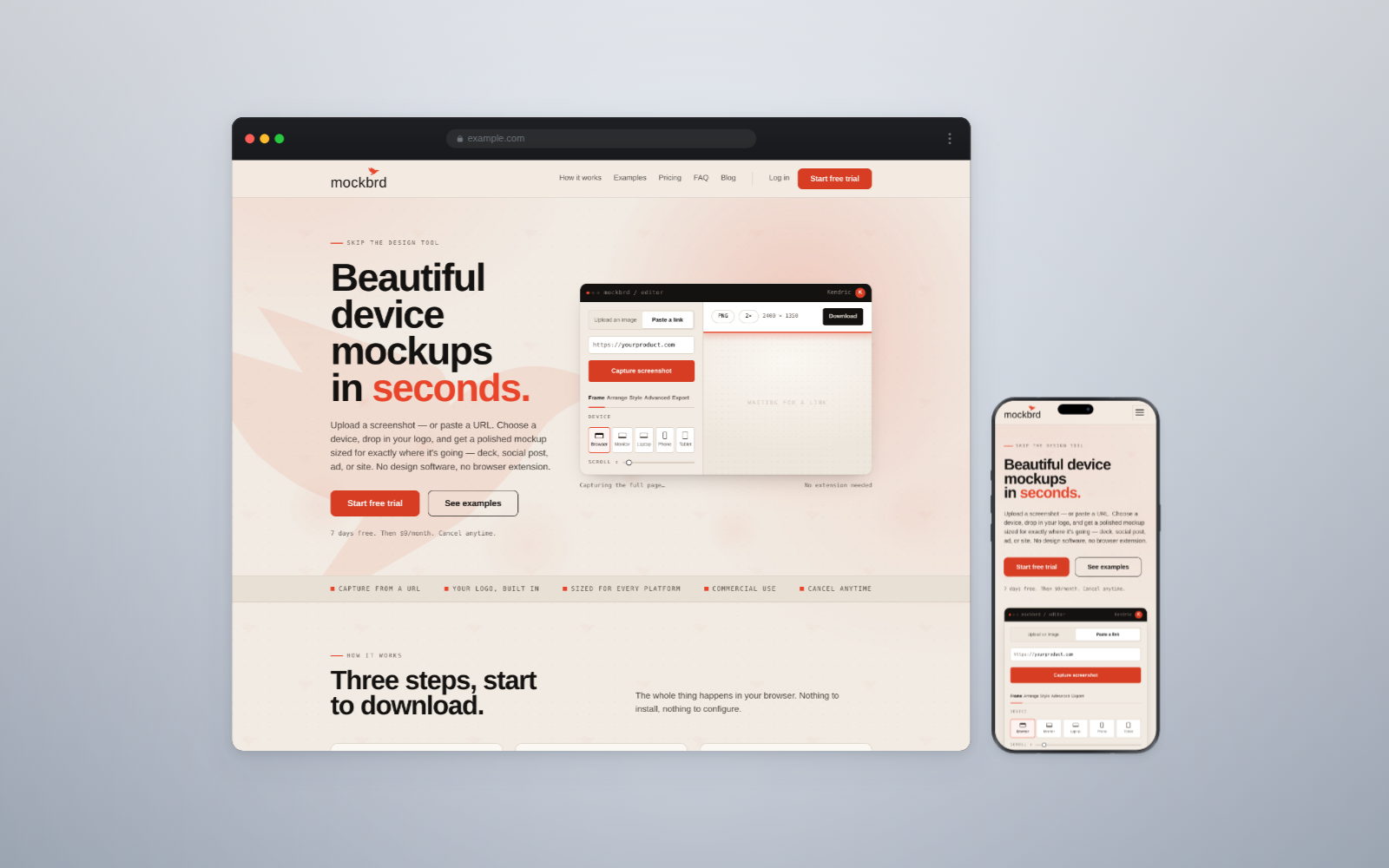
A desktop page, captured at desktop width, dropped into a phone frame.
The page inside is the desktop layout. It is now four hundred pixels wide and unreadable, and anyone who knows what they are looking at can see the screenshot was not captured on a phone. You have shown them your desktop design and told them it is your mobile one.
Capture at the width of the device you are going to frame it in. A mobile mockup should contain a page that was loaded at mobile width, with the mobile navigation and the mobile layout. This is a five-second decision at capture time and it is invisible to fix later.
How many devices in one image
The urge is to show the responsive story — phone, tablet and desktop together — and it is almost always a worse image than one device.
Three devices means three screens at a third of the size each, and the viewer now has to decide which one to read. What they usually do is read none of them. The responsive story is real but it is a second image, not the hero.
Two devices works when the two are doing different jobs: a desktop showing the dashboard and a phone showing the alert, side by side, is a sentence. Three of the same screen at three sizes is a feature list.
One device, large, is the default and should be the thing you talk yourself out of rather than into.
Scale and light, which are the same problem
The two things that separate a mockup that looks made from one that looks downloaded:
Scale consistency. Every image in a set at the same device width. This sounds trivial and it is the single most common reason a portfolio or a deck looks uneven. The eye is extremely good at detecting that two things which should match do not.
One light source. A shadow implies a light. If your shadows fall in different directions across a set, you have implied several lights in one room, and it reads as wrong without anyone being able to say why.
Keep the shadow soft, wide, tinted toward the background rather than pure grey, and in the same place on every image. A hard grey shadow offset down and right is the fastest way to date a piece of work by fifteen years.
When to use no frame at all
There is a case for the bare screenshot, and it is a real one.
If the subject is a detail — a single component, a state, an interaction you want someone to look at closely — a frame is noise. It adds a device nobody is asking about around a thing that is 200 pixels across.
The rule: frame it when the claim is "this is a product". Do not frame it when the claim is "look at this specific thing".
Documentation and changelog images are usually the second kind. Marketing images are almost always the first.
The bezel budget
A useful way to think about it. Every frame costs you area — the pixels spent on hardware rather than on your product.
- Browser frame: about 8% of the image.
- Phone: 15–20%, and it forces a portrait composition.
- Laptop: 40–55%, because of the base.
- Monitor with a stand: 35–45%.
None of those numbers are wrong to spend. But you should know you are spending them. A laptop frame in a 1200 × 627 LinkedIn image leaves your actual interface about 500 pixels wide, which is not enough to read a table in.
The best frame is the one that is true and cheap. True, because a wrong claim about your product is worse than no claim. Cheap, because every pixel of bezel is a pixel not showing what you made.
The underlying idea
Pick the frame that describes how your product is actually used, capture at that device's own width, use one of them rather than three, and keep the light the same across the set.
Then stop thinking about frames, because the screen inside is the part anyone came for.